 The can-of-worm-iness of composition rules is, well, uncanny. As soon as I was satisfied with what I had learned about the rule-of-thirds (and the golden ratio), I found another three schemes, which didn’t do me a whole lot of good, because, having an engineering mind, it’s hard not to succumb to taking a formulaic approach to my art. Really hard.
(If you’re not familiar with the rule of thirds or the golden ratio, I suggest that you read my previous article before reading this one.)
It’s just fitting, then, that we continue falling into the “science” of composition with the Golden Spiral.
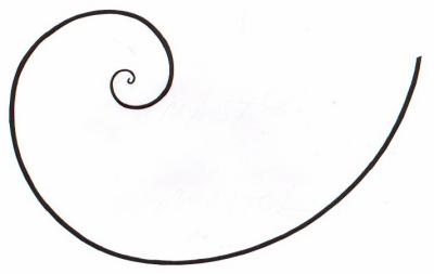
While at first it doesn’t seem so, this spiral is golden because it’s based on the golden ratio. See?
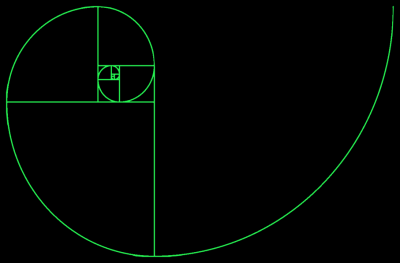
In this case, however, things can get pretty complicated: spirals are directional (i.e. clock-wise or counter-clock-wise), and photographs have four corners (maybe at some point instagram will make round images the “thing,” but for now, oblong it is), which means that for any given image you actually have eight choices! (Fortunately, all 8 curves coincide in 4 points.)
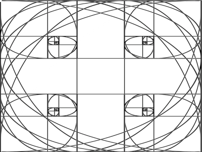
Yes, there can be such a thing as too many choices. Especially when you’re staring at something (or someone) through the lens, trying to figure out the best way to compose the shot.
From what I’ve seen so far, unlike the previous rules I mentioned, there are three approaches to spiral-based composition, and since I haven’t come across any information referring specifically to this, I’ll take the liberty of naming them:
- Position-based
- Weight-based
- Flow-based
Position-based
The first one’s the easiest to understand and apply and it works exactly like the rules of thirds and golden ratio: the subject coincides with the vortex of the spiral:
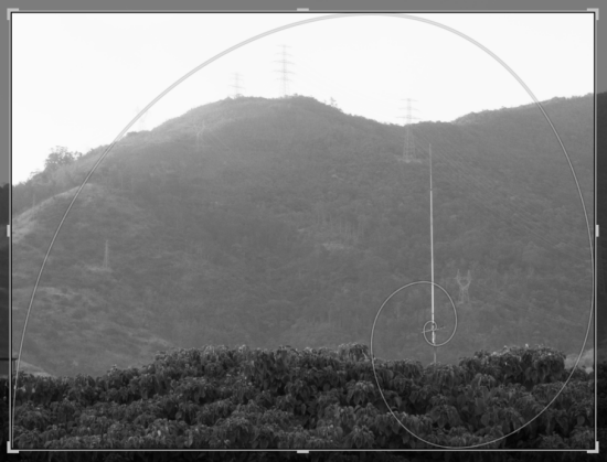
You can place the “interesting” element of the image in the vicinity of the spiral’s vortex. This will yield a compositional result similar (but not the same!) to applying the rule of thirds, except that the focal point will be slightly closer to the edge. I’ve done this unknowingly many times and it’s a popular approach in movies for single-character shots during dialogues.
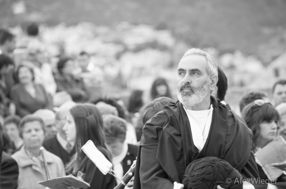
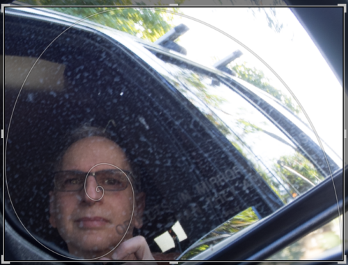
This is a good idea for portraits or photographs in which there is a single, rather distinguishable, subject or feature, and isn’t hard to accomplish.
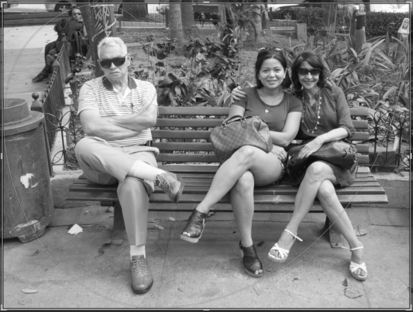
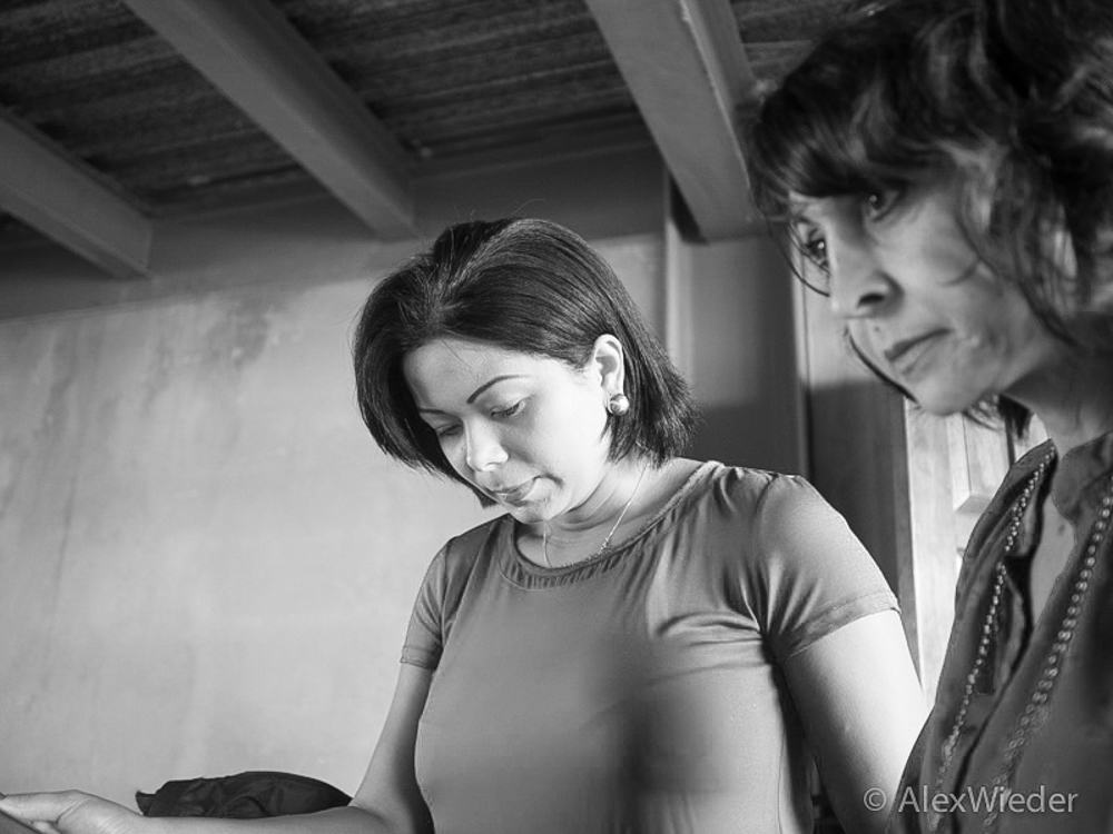
Considering that faces tend to follow the golden ratio, the technique works pretty well for portraits. Even though this next picture looks like an affront to the rule of thirds or the golden ratio, I still find it compositionally interesting:
Weight-based
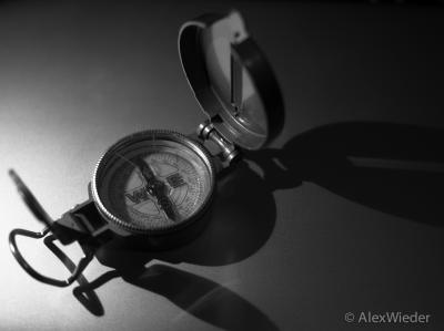
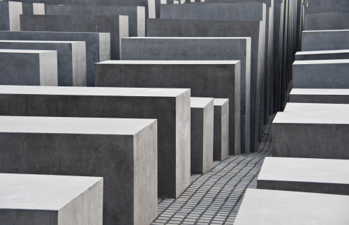
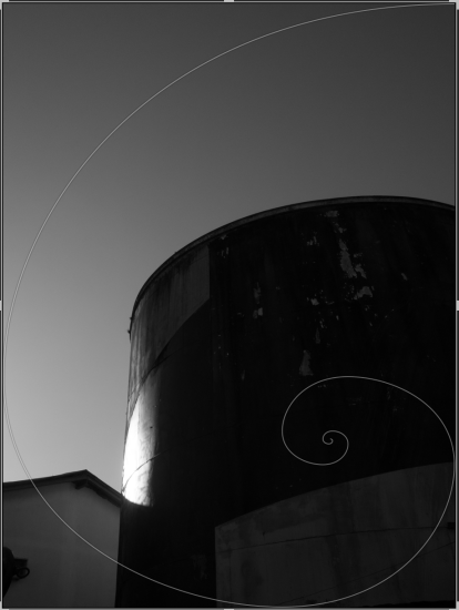
If the image you’re composing contains “heavy” elements, such as mountains, boulders, buildings, or even large areas of homogeneous color or light (shadow is the lack of brightness, smartass), it’s sometimes possible to make it all work nicely together by matching the way they “interact” with one another to the way the sections of the spiral do the same.
Here’s another example of this principle in action:
Flow-based
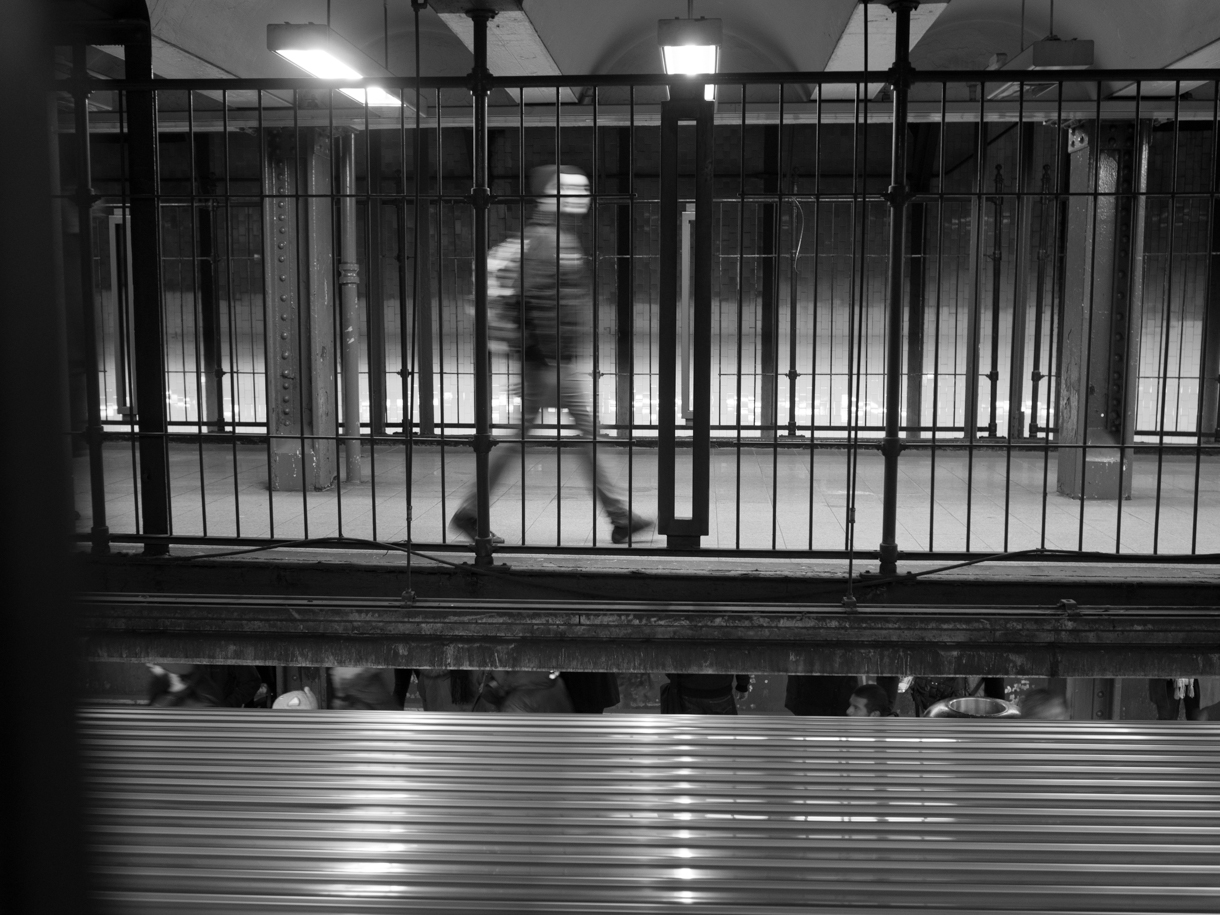
There are images to which the application of the golden spiral isn’t expressed in static compositional terms, but rather on their dynamic aspect, or to say it more artistically, their “flow.”
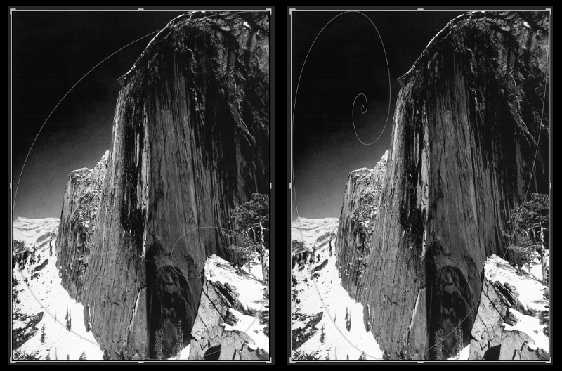
In the double image above (not surprisingly, since it was shot by Ansel Adams), the golden spiral works both ways, albeit the spiral “spins” in a different direction in each case. (If you take a closer look at the image, you will notice how the horizon cuts the image precisely at the golden ratio.)
Spiral staircases are the [no-brainer] poster-child of flow, and they’re an excellent starting point. I’d be hard-pressed to find a better illustration of this “flow” principle: your eyes follow the cues it gets and land on the focal point of the image, hopefully after an enjoyable little visual trip.
Stairs in general are great for this, and they’re a very tempting object. So much, actually, that some photographers shoot stairs for the most part (I know of at least one that did little or nothing else, but, for the life of me, all I can remember is that she lived in Jerusalem in 1985 and that I’m very sorry for the plate we broke and then hid back under the others in the cupboard).
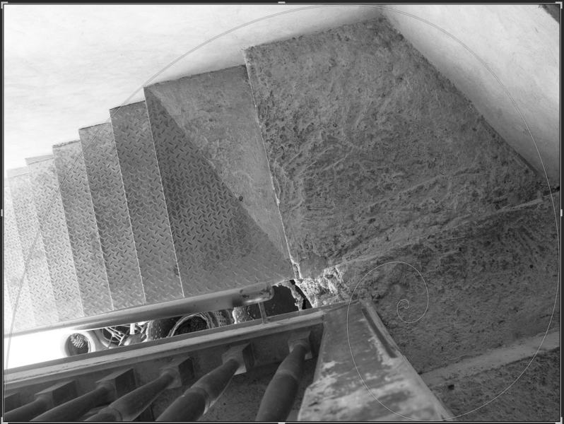
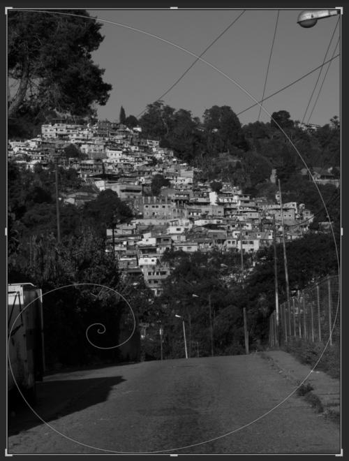
“Flow” takes on various forms. It can be the subject of the photograph, as in the previous picture, it could refer to how the subject is framed or to the subject’s shape, or even to how your eyes will travel around the image before they settle on something (hopefully what the photographer had in mind):
Combining approaches
Now that you’re aware of all this, if you take a second look at the pictures, you should be able to notice that some of them could be looked at in more than one way:
The picture of the antenna, could also be appreciated from the flow point of view – as your eyes follow the spiral, they’ll be skipping from one transmission tower to the next.
My portrait is framed in a “spirally” way by the rest of the car.
The storage tank picture is weighed in a spirally way, but the shapes also follow this path.
The staircase is composed based on flow, but the light and dark areas are distributed following the spiral’s curve.
Conclusion (so far… it could change…)
The golden spiral’s an interesting beast, but I must confess that it’s really hard to consciously compose for it – eight choices, three possible ways to apply it -I can’t imagine things getting more complex than this.
If you want to experiment with spirals, I suggest you start with inanimate objects – they don’t get bored as quickly as wives and friends and, best of all, no faces and eye-rolling, which means that you can spend as much time as you need. And even then, at least in my own experience until now, I’m finding that all of this is much easier said than done – I’ve been taking pictures for three weeks now, trying to keep this composition device in mind and all of them needed to be adjusted in lightroom (some more, some less).
Nevertheless, starting out with intent, makes editorial work easier, so I can’t fully discredit this as a technique to be applied while shooting, and even though I’m not keen (at all) on re-composing, the results are rather interesting.
