 (Haz click aquí para leer en Español)
Histograms are all everyone seems to be talking about lately. The problem with throwing such a cool-sounding term around is that, while everybody in the audience has a tendency to nod automatically, as if by reflex, few people really know what this type of graphic means (or how useful it really isn’t).
A histogram is simply a representation of how often something happens. In the case of images, it refers to the distribution of each color value within the sample (that’s statistiquese for “image”).
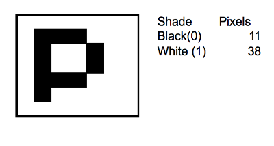
If you start with a really simple example: Imagine that you have a really crappy digital camera. So crappy, in fact that it only takes 49 pixel photos (pixels, not mega-pixels) and your images are 7 x 7 pixels. And with this camera, you take a close-up of any letter on this article. A “p” would look something like this:
Actually, the camera’s so crappy, that it doesn’t take color photographs, and even at black-and-white it sucks because it doesn’t capture shades of gray but only black and white. This means that every pixel in the image can either be black (0) or white (1).
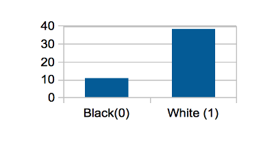
The histogram of the above image would tell you that of the 49 pixels, 11 are black and 38 are white. It would look like this:
The X (or horizontal) axis shows you the possible values each pixel can take, and the Y (vertical) axis shows you how many pixels there are of each value (or shade). That’s it. That’s a histogram.
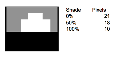
Then, imagine that when the manufacturer finally released an upgrade, it was still disappointing that the pictures would still be limited to 49 pixels, but the good news were that the new model was able to capture gray as well. Your first shot was of a magnificent sunrise, and it looked like this:
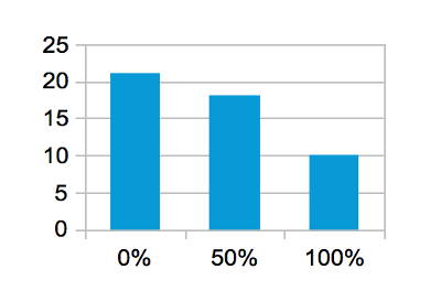
Not too impressive, I know, but that’s how the sun rising looks like in 49 pixels and 3 possible shades of gray. Since we now have three possible values for each pixel (black, gray, and white). This time, the histogram will have (you guessed it) three columns: one for black (0% luminance), one for gray (50% luminance), and one for white (100% luminance):
In essence, each column of the histogram represents how many pixels there are in the image with the shade that the column represents.
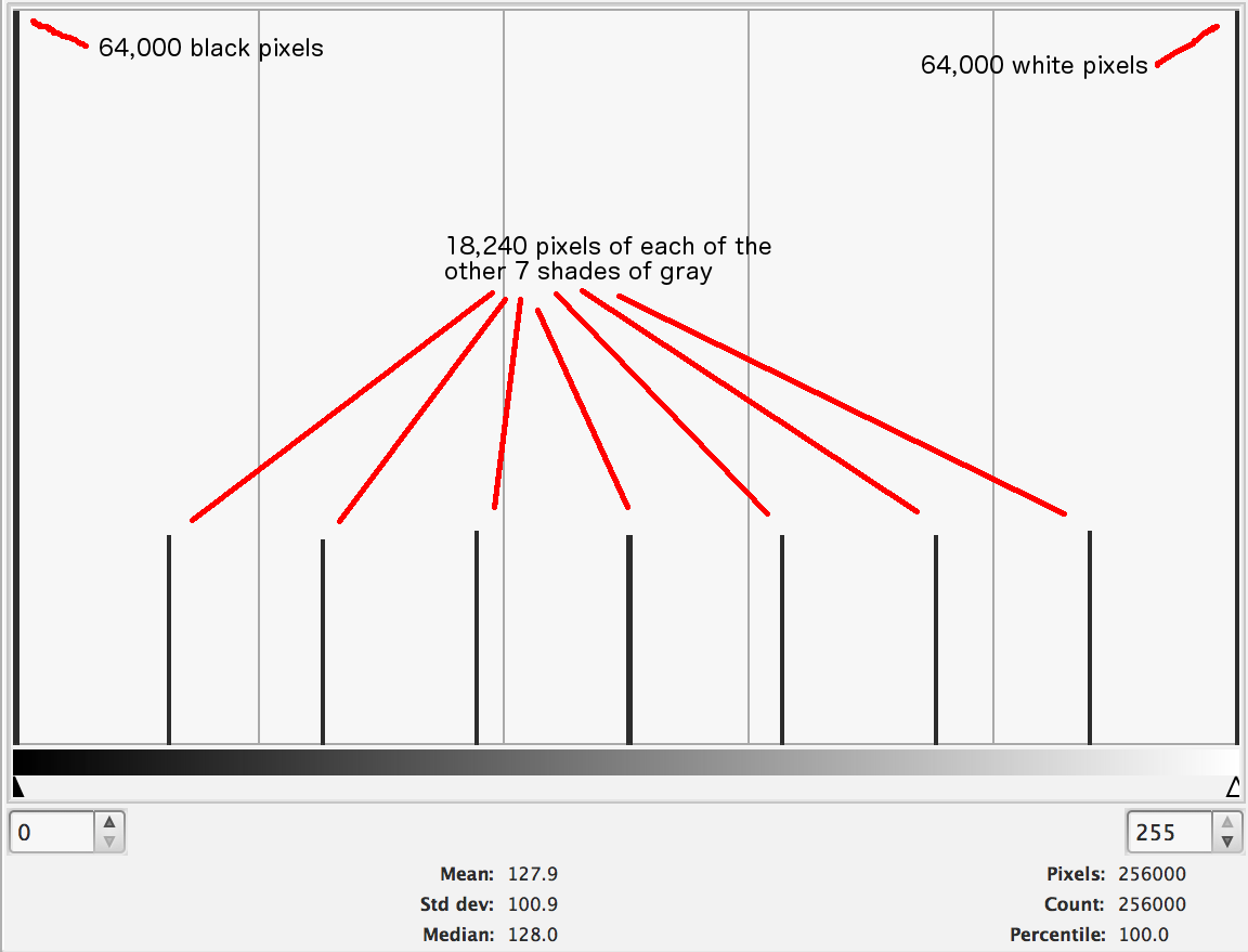
Now that you got the basic idea, let’s see it in action with a more complex image. The following image has 9 distinct shaded areas:
The histogram shows the number of pixels for each shade. Since there are 9 shades, there are nine distinct peaks in the histogram. This histogram, however, represents the number of pixels shown in any of 256 different shades, hence the solitary peaks.
25% of the image is covered by a large black patch (you can see the corresponding tall bar on the extreme left side of the histogram) and another 25% of its area is covered by a large white patch (represented by the tall bar on the extreme right). The remaining 7 lower peaks represent the corresponding smaller shaded areas in the image.
If you’re wondering about image secrets unveiled by histograms, you’re in the wrong place. They don’t tell a whole lot about an image that you wouldn’t already know by just looking at it. High-key, Low-key, and so on, you can already tell from the image itself and these aren’t particularly useful pieces of information.
Peaking (areas where detail – also referred to as “information” by some – is lost in a sea of black or white) isn’t evident by looking at a histogram. The presence of lots of dark (or light) pixels, as expressed by an image’s histogram, is no indication whatsoever of peaking.
But then, having learned all this, simply by looking at the following image, you wouldn’t know that there’s something quite wrong with it, would ya?
Look at its histogram. Is there anything missing?
It’s missing 192 shades of gray, dude! I reduced the number of shades from the 256 in the original image down to 64. While we’d like to believe that our eyes are super-sensitive optical instruments, they just aren’t all that magnificent. Disappointing, I know, but true: It’s very hard, if not impossible, to appreciate minute color differences. If you’re a married man and have ever had a conversation about painting the living-room with your wife, you probably know exactly what I mean (there’s a good possibility that women looking at the image above would be able to tell that something’s amiss – the ability to discern colors comes straight from cave-women and it has to do with discerning ripe and poisonous fruits).
Here are the original and the doctored images in case you want to compare (get your wife; maybe she can tell them apart:
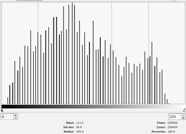
In this case, though, the histogram is useful, as it makes it quite evident that the image in question is missing information. To assuage your curiosity, here is the original image and its histogram:
Now that you know how to read and interpret a histogram, I must say, though, that I don’t find them to be terribly useful. In post-processing they can tell you, at a glance, that your image is missing information, like in the example above, or that the dark areas in in it aren’t really black (there would be no “bars” on the left side of the histogram) or that your whites aren’t really white (no “bars” on the right side of the histogram), but I’ve never found myself looking at a histogram to get information that wasn’t evident from the image itself. There are characteristic curves for high-contrast, low-contrast, high-key (bright), and low-key (dark) images, but their presence doesn’t guarantee that the picture bears the corresponding qualities. In essence, no amount of histogram interpretation will yield as much information as looking at an image.
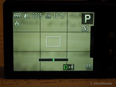
And the same is true for shooting. Many, if not all, digital cameras have histogram functionality right on the view-finder or screen, and it’s really cool to be able to see a histogram in real time (I’m surprised Hollywood didn’t include one in Terminator’s point-of-view scenes – perhaps because it wouldn’t aide in finding Sarah Connor), but then, again, composition and exposure should be your priorities when shooting, not looking at a graph that tells you little or nothing about what you’re about to photograph.












One Trackback
[…] (Click here to read in English) Todo el mundo parece estar hablando de histogramas últimamente. El problema al abusar de un término que suena tan importante como este es que, si bien todos en la audiencia tienden a asentir automáticamente, por reflejo, pocas personas realmente saben lo que este tipo de gráfico realmente significa (o cuán útil realmente no es). […]