 There’s a mathematical principle, dating back to the Greek that governs what is widely accepted as good composition. It’s the golden ratio. (According to lore – as I can’t find anything authoritative about it – the rule of thirds is a simplification of this).
A few weeks ago I attended a lecture about composition by David Brommer. It was one of the best presentations I’ve ever attended. During the questions segment of the event, and considering that David’s had the opportunity to play with far more cameras than anyone I know, I asked him about the rule-of-thirds grid on my camera’s viewfinder.
My old Nikon D90 has a grid that splits the image area in nine identical rectangles, and so does my Canon S110 (and so did an old Sony, and even my phone!).

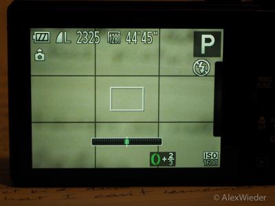
My current “big” camera, an Olympus EM-1, however, doesn’t. Its grid lines are arranged in such a way that the four intersections are very close to the center of the image:

I’m so accustomed to the rule of thirds, that ever since I started using this camera, I’ve been taking its grid as nothing more than a guideline, but haven’t been really working with it.
But my curiosity got the better of me: it doesn’t make a whole lot of sense for a company like Olympus to botch something like this and not see any backlash for it, so I started looking for an explanation.
And my first instinct was right: there’s nothing wrong with the grid; it’s just not a rule-of-thirds grid. It turns out it’s a “Phi grid:” It’s used the same way as the rule-of-thrids grid, but the placement of the lines obeys the golden ratio. In other words, there’s more than one way to skin this cat…
The golden ratio, or to save you a lot of reading, 1:0.618. The math behind it is not rocket science, but you better paid attention in algebra class:
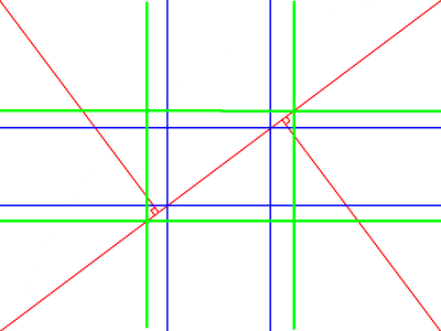
Given a segment of length A, split in longer segment of length B (red) and a shorter one of length C (green), if the total length is 1.618 times the length of the red segment, the length of the red segment will also be 1.618 times the length of the green segment:

As long as you keep splitting the segments following these proportions, you will end up with a ratio of 1.618 whenever you divide the segment you just split by the length of the longest resulting segment.
Interestingly, Fibonacci, who’s more famous for his numbers series than for raising rabbits (that’s how I heard he came up with the series), also reeks of the golden ratio. Fibonacci’s series, in case you like numbers, is a series of numbers in which every number is the result of the sum of the previous two: 0, 1, 1, 2, 3, 8, 13, 21, 34, 55, 89, 144, 233… If you divide any of the numbers in the series by the number right after it, you’ll get 0.618 or something quite close to it.
“Anyhoo,” the golden ratio has been followed by artists and architects, for millennia, as the mathematical representation of beauty. Well before the first photograph was ever shot. Two of the best known examples of its application are probably The Parthenon, in Greece, and the UN building, in New York City. There are plenty of explanations and papers about it on the internet, so I won’t dwell any more on this, but of all the places I’ve looked for information about this, my favorite is a video (yes, I’m serious) featuring Donald Duck.
The Golden Ratio has been with us since the beginning of time, though, and if you look closely, you will find it everywhere in nature: flowers, seashells, insects, galaxies, etc.
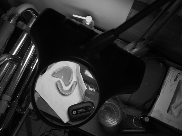
I find it even in my bed, whenever I go to sleep very late:

With regards to whether to stick to the rule-of-thirds grid or the phi grid, after playing with both, I find them both equally usable: ever since I ran into the existence of TWO distinct, albeit similar, grids, I’ve found that some images are better suited for one of them, so I’m playing strictly by ear. Some compositions clearly lend themselves better to one or the other, so it’s really a matter of what works for you.


