 (If you’re not familiar with the Golden Spiral or Golden Ratio, I suggest that you read my previous article before reading this one.)
If you believe that love triangles are complicated, just try looking for composition techniques based on triangles. Took me about 6 hours just to get the terminology right.
There are several composition techniques based on triangles, but since we seem to be on a roll with Golden anything, I’ll focus here on Harmonious Triangles and the so-called Golden Triangles (you’ll see why later).
These two grids are so similar that their names are often confused (misused, if you ask me), and, in my opinion, you’d have to have them tattooed on your retinas to tell them apart and pick one or the other while shooting.
Harmonious Triangles
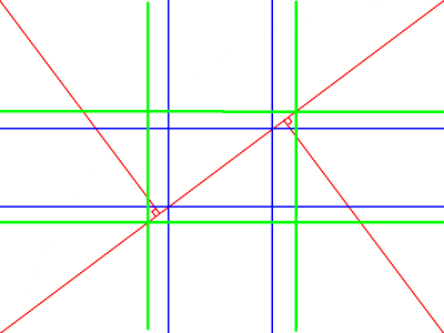
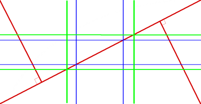
Since an image is worth a thousand words, here’s what these look like (blue – golden ratio or phi grid / green – rule of thirds grid / red – harmonious triangles):
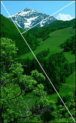
At best, it seemed like a device for landscape photography (their classic application), in which you’re very likely to have first (close), second (half-way), and third (far) planes:
The triangles used to create the grid are drawn by first drawing a diagonal and then intersecting it with lines originating from the remaining corners, at right angles.
I bet you’re wondering what’s the point of yet another composition device if its use will likely yield the same results as the rule of thirds or the phi grid. That was my reaction, at first. Especially because I came across several web sites erroneously stating that the intersections coincide with those of the phi grid. This triangular pattern has nothing to do with golden ratios and anyone calling it golden anything, is mistaken: the intersections will coincide with phi grid only if the image’s width:height ratio is golden (1.618).
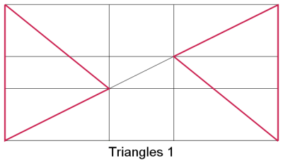
As the image’s width:height proportions change, the intersections will move farther or closer to the center of the image – for a square image, you will end up with two diagonals (intersecting at the center), but for most photographs, as their width:height proportions are close to phi (1.618), the intersections will fall in the vicinity of the points of interest of the rules-of-thirds or phi grids. See what happens when the proportions go well beyond phi:
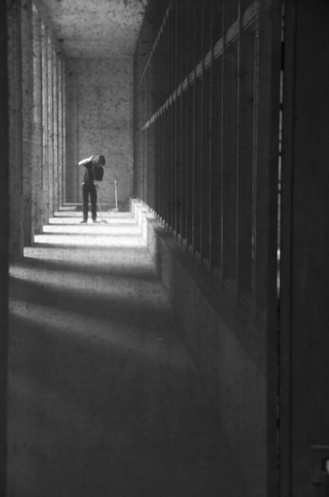
What I like about this grid is that it actually has more uses than the trite “snow-covered-mountain-in-the-background” motif. It works nicely for head-shots, as you can see in the picture below by photographer César Sánchez (http://www.cesarjsf.blogspot.com.es). If you happen to visit his web site, you will notice a lot of good examples of the composition techniques I’ve been writintg about.

[So-called] Golden Triangles
This grid doesn’t include golden triangles either, but the triangles in it are drawn based on the phi grid. I suppose this makes them golden, and it’s an easy term to use, but still, technically incorrect. To make things even more fun, there are two variations of this theme, and they can both be used differently:
This is the easiest way to build the grid, as all the vertices fall either at the corners of the image or at the two “interesting” points of the phi grid that are touched by the diagonal.
Imagine a diagonal line, and then intersect it with shorter segments where the diagonal intersects the phi grid (since there are two diagonals to every image, there will be two possible arrangements of these triangles).
I’m using images whose proportions aren’t close to 1:0.618 (phi or Golden Ratio) to emphasize the differences. Several of these schemes look exactly the same when the image is proportioned according to phi.
This variation of the triangle-based scheme works allow for a weight-based approach, as well as for one based on the points of interest, as long as you place those along the diagonal line you started with.
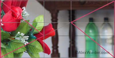 The other flavor of “golden” triangles is a bit harder to “see” while shooting because you have to eye-ball where the vertices should be:
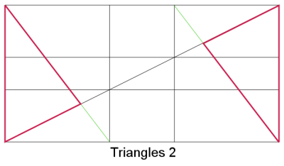
When using this variation of the theme, you have two options: you can place the “heavy” or interesting parts of the image within the triangles or between them. I personally prefer the former, because I’m not a big fan of symmetry (even though I break this and other rules from time to time). And just like the harmonious triangles approach, it works very well for images that have three planes:
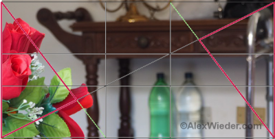
When the subject of the image is placed in the middle, you can think of the shorter diagonals as the shores of a river that will be followed by the observer:
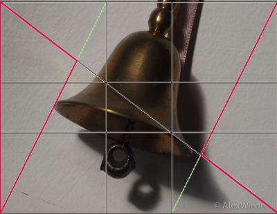
THE Golden Triangle
The true Golden Triangle has nothing to do with the triangles I wrote about here. It’s a mathematical construct that’s more related to the Golden Ratio (of course!) than with composition:
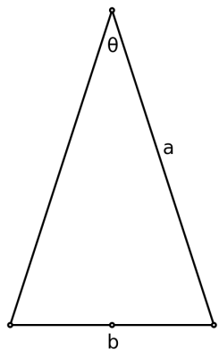
According to WikiPedia, it’s an Isosceles triangle whose equal sides (a) are 1.618 times longer than the shorter side (b). They are found in pentagrams (5-pointed stars), which takes us back to the Donald Duck video I mentioned when I started writing about composition.
As far as composition is concerned, I found just one reference to it online and it wasn’t particularly convincing.


